Make a Great Color Palette
Make a Great Color Palette
RGB is a popular way to represent color on websites, but it's often not the most convenient option.
For example, with RGB values, it's hard to tell what a color actually looks like just by reading the numbers.
#0BAD31
No idea, right? That’s the thing — RGB isn't exactly human-friendly.
HSL
HSL was designed to better align with how humans perceive color by breaking it down into three intuitive attributes: (H)ue, (S)aturation, and (L)ightness.
Hue
Hue refers to a color’s position on the color wheel. The colors on the wheel are pure hues, meaning they are distinct and easily recognizable. This attribute helps us label two different-looking shades as "blue", even if they vary in brightness or saturation.
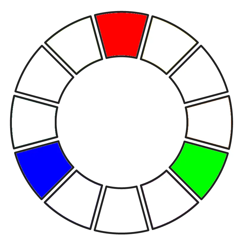
Hue is measured in degrees, with 0o as red, 120o as green, 240o as blue. To make things more straightforward, let's construct a basic 12-color wheel.
We’ll start with the foundation of the color wheel: the primary color triad: red, green, blue - also known as the first-level colors.
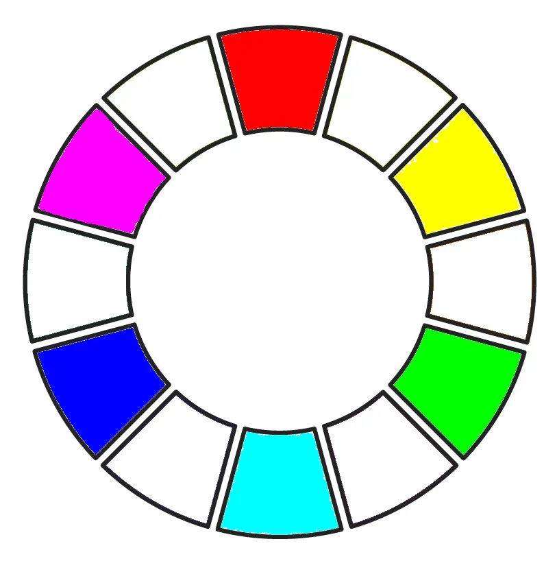
Next, we add the secondary colors (also called second-level colors) by mixing two primary colors in equal amounts. These mixed hues are placed between the two primaries they come from on the wheel.
For example, mixing red and green gives you yellow, which sits between red (0o) and green (120o). The idea is simple: the level of a color refers to how many other colors were mixed to create it - the more mixing, the higher the level.
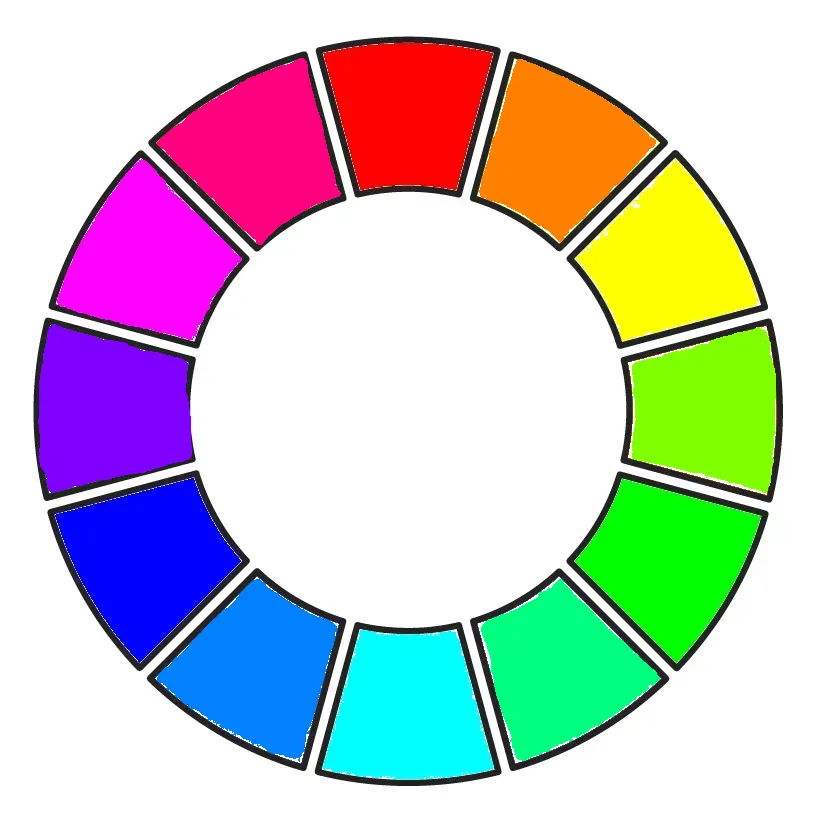
Finally, we complete the wheel by adding the tertiary colors (or third-level colors). These are created by mixing one primary color with one adjacent secondary color. Just like before, each tertiary color is placed between the two colors used to create it.
At this point, our 12-color wheel is complete - made up of 3 primary colors, 3 secondary colors, and 6 tertiary colors. It gives us a full spectrum of hues, evenly spaced and easy to understand.
Beyond tertiary colors, we can keep going - adding fourth-level, fifth-level, and so on - by continuing to split the segments between existing colors and mixing accordingly. Each new level brings even finer variations.
In other words, the color wheel can be expanded infinitely. With each split, we get closer to the continuous spectrum of color that the human eye can perceive. This is how digital tools can represent millions of colors, even though they all stem from just a few core hues.
Saturation
Saturation describes "how intense or colorful" a color is. It tells us how much the Hue influences the appearance of the final color.
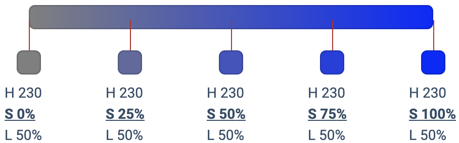
Saturation ranges from 0% to 100%:
- At 0%, there's no color at all — just shades of gray.
- At 100%, the color is at its most vivid and pure.
If saturation is set to 0%, the hue becomes irrelevant - changing the hue value won't affect the color at all. It'll always appear gray.
Lightness
Lightness is exactly what it sounds like — it defines how close a color is to black or white.
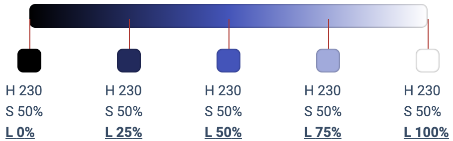
- At 0%, the color is pure black
- At 100%, it’s pure white
- At 50%, you get the true, vivid version of the hue
Let's look at the previous example:
#0BAD31
Equivalent to
HSL(134, 88%, 36%)At a glance, we can get a sense of how it looks:
- Hue 134 puts it near the "green" section of the wheel
- Saturation 88% means it's "very green" — strong and vivid
- Lightness 36% tells us it's on the darker side
So, we can sum it up as:
👉 A dark, very green color
Pick colors for palette
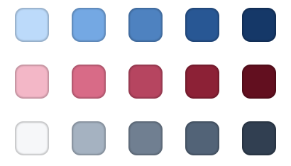
In modern web design, a good color palette usually includes 3 main types of colors:
- A neutral color – usually shades of gray
- A primary color – used for branding, buttons, links
- An accent color – used sparingly to draw attention
Each of these color types typically needs 6-8 shades (for hover states, borders, backgrounds, etc.). That means to build a solid, flexible design system, you’re looking at around 18 colors — which sounds like a lot, and yeah, it can be time-consuming.
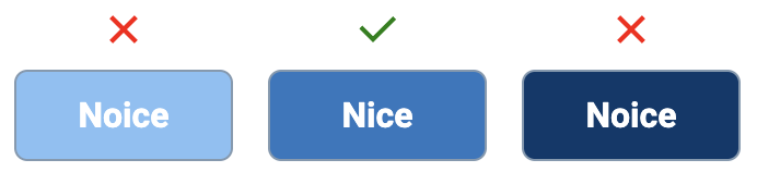
Choose a base color
When it comes to your primary and accent colors, everything starts with the base shade — the one in the middle of your range. Lighter and darker versions are then created around it.
There's no perfect formula for picking the base, but here's my good rule of thumb:
Choose a color that looks good as a button background.
This helps ensure it has strong presence and visibility in your UI.
Oh, and don't forget: check its contrast ratio (e.g., with WebAIM’s Contrast Checker) to make sure it's accessible and meets WCAG guidelines.
💡 Note:
The "middle shade" doesn't necessarily mean 50% lightness or any specific HSL value. Every color behaves a little differently some look darker or lighter even with the same settings.
So instead of relying purely on numbers, trust your eyes - and ideally, do it on a calibrated, high-quality monitor. Visual balance matters more than mathematical precision.
Define the Boundaries
Next, choose your darkest and lightest shades. In practice, these are often used as background and text colors in dark mode and light mode, respectively.
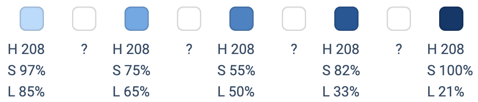
Lock the Hue from your base color, then adjust saturation and lightness until the shade fits the need. In this step, lightness is the main axis - so decide your minimum and maximum lightness values.
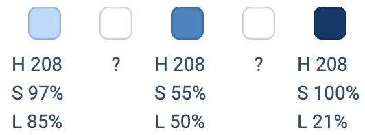
⚠️ At very high or very low lightness levels (close to 0% or 100%), the hue can almost disappear. To bring it back, try increasing the saturation — especially when lightness gets further from 50%.
Filling gaps
Now that you've locked in your darkest, lightest, and base shades, it's time to fill in the gaps.
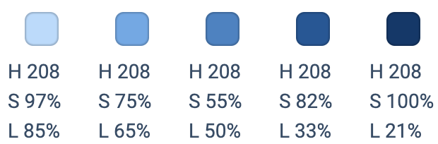
Pick a few points between them, adjusting the lightness gradually and fine-tuning the saturation to keep the color looking natural.
If you need more steps, just repeat this process by subdividing the space.
This strategy creates a color scale that feels linear — smooth and consistent, visually.
Apply the same logic to your neutral (gray) and accent colors, and you'll end up with a clean, modern, and consistent color system.
Conclusion
There's no magical formula for picking the perfect color palette. But with a few smart techniques, you can let math and structure do the heavy lifting.
Build with intention, test with your eyes, and let color theory back you up.